Hypertension Trends
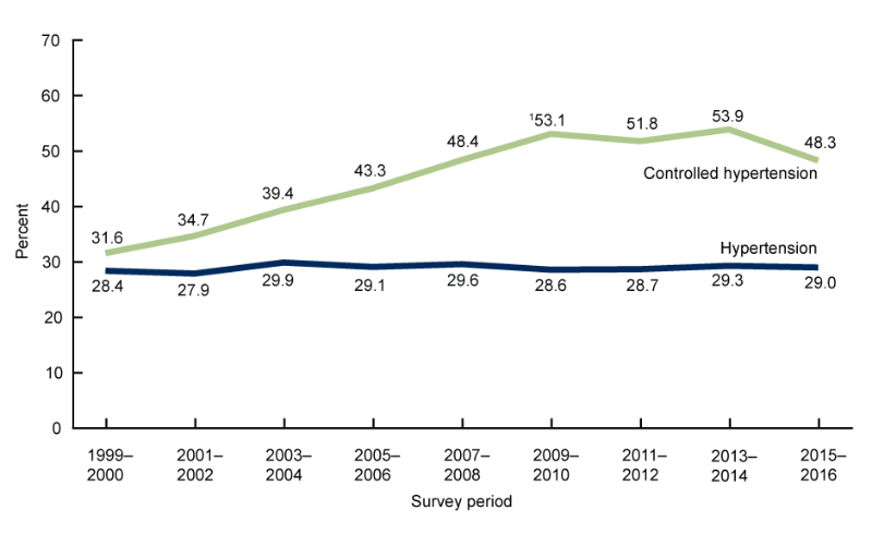
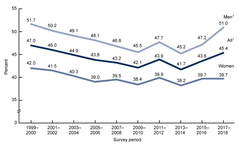
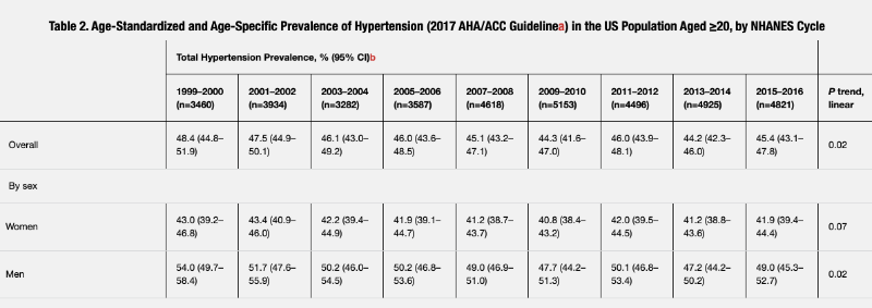
When we turn our attention to the historical data of the prevalence of hypertension among Americans, we’ll notice that the reported trends for the same time periods are quite different between publications. Let us compare the visual presentation of the prevalence of hypertension from two consecutive reports (2017 and 2020) available at cdc.gov.

One year, we witness a flat-line trend, while the next report shows a sawtooth pattern for the same period. What is going on here?

If we were to change the protocol for reporting this data by removing the medically controlled cases, then we could see a somewhat positive trend. Otherwise, the overall picture looks pretty sad.
Suppose you look at the reports for pharmacologically controlled cases of hypertension for the period between 1999 and 2016. In that case, you can spot the curve lowering in terms of the population affected by hypertension, attributed to medical intervention and, possibly, nothing else.

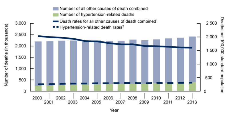
But, no matter how you choose to report this data, mortality rates associated with hypertension are still on the rise. I guess that managing the condition with pills doesn't protect you from the long-term consequences. To quote the report for Hypertension-Related Mortality in the United States, 2000-2013:
The number of hypertension-related deaths increased by 61.8%, from 245,220 in 2000 to 396,675 in 2013. Overall, the number of deaths from all other causes of death combined increased by 3.5% during the same period.

If you wish to investigate this subject further, I encourage you to do so on your own, as I believe I have conveyed the point that there is no significant correlation (if any) between increases in physical activity and the reported rates for the prevalence of hypertension.